← Return to Case Studies
UI/UX / Web / Branding
HartFixr
We were tasked by our stakeholders to develop a digital platform, comprising both an application and a website, designed to serve as an educational hub for heart-healthy lifestyle management, including meal planning, recipes, and medical guidance.
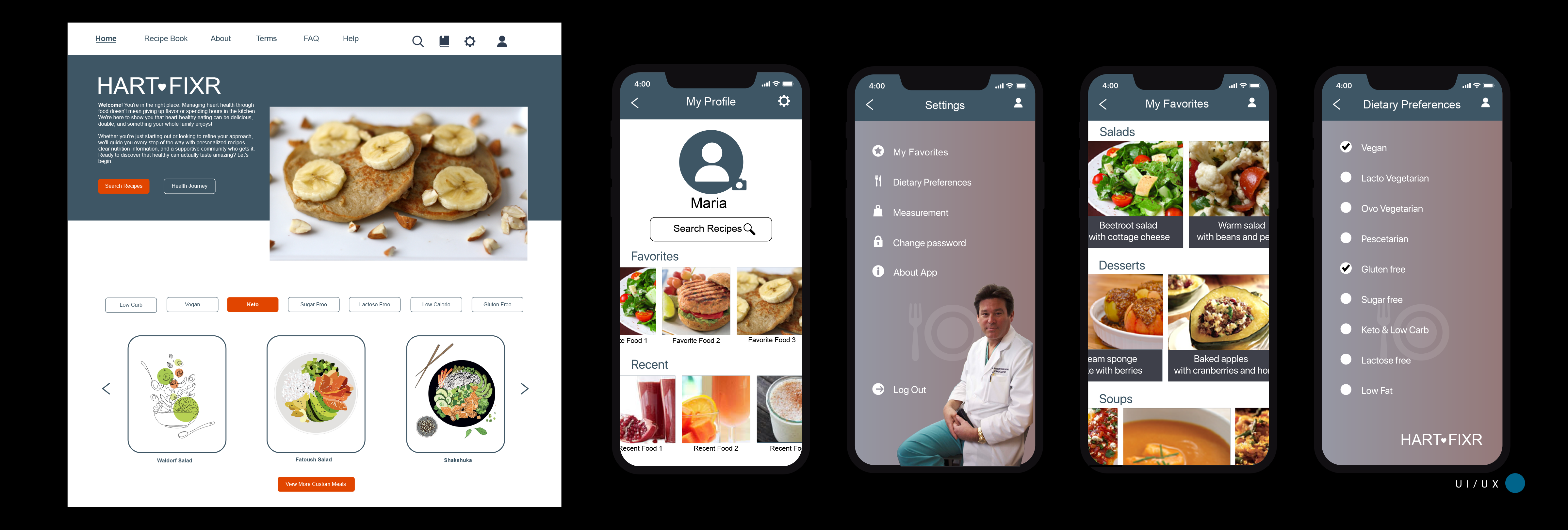
Role
Led comprehensive user research initiative for a heart-healthy recipe app targeting adults managing cardiovascular health. Owned end-to-end research process from planning through synthesis, delivering actionable insights that shaped product strategy
Deliverables
User Persona Development, Comprehensive Usability Testing Reports, Journey Mapping, Competitive Analysis, Strategic Recommendations Report, User Flow Diagrams, Prioritization Framework, branding, design, product development and delivery

Post-Launch Metrics:
User feedback showed promising results
Behavioral change is emotional, not just functional - addressing emotional needs drives retention more than feature additions
Critical moments matter more than averages - Week 3 crisis affects 85% of users; designing for this moment has outsized impact
One size fits nobody - persona-specific experiences dramatically outperform generic approaches
Data transparency is non-negotiable - for analytical users, one inaccuracy = instant churn
Community multiplies retention - social connection creates 2.3x retention boost at minimal cost

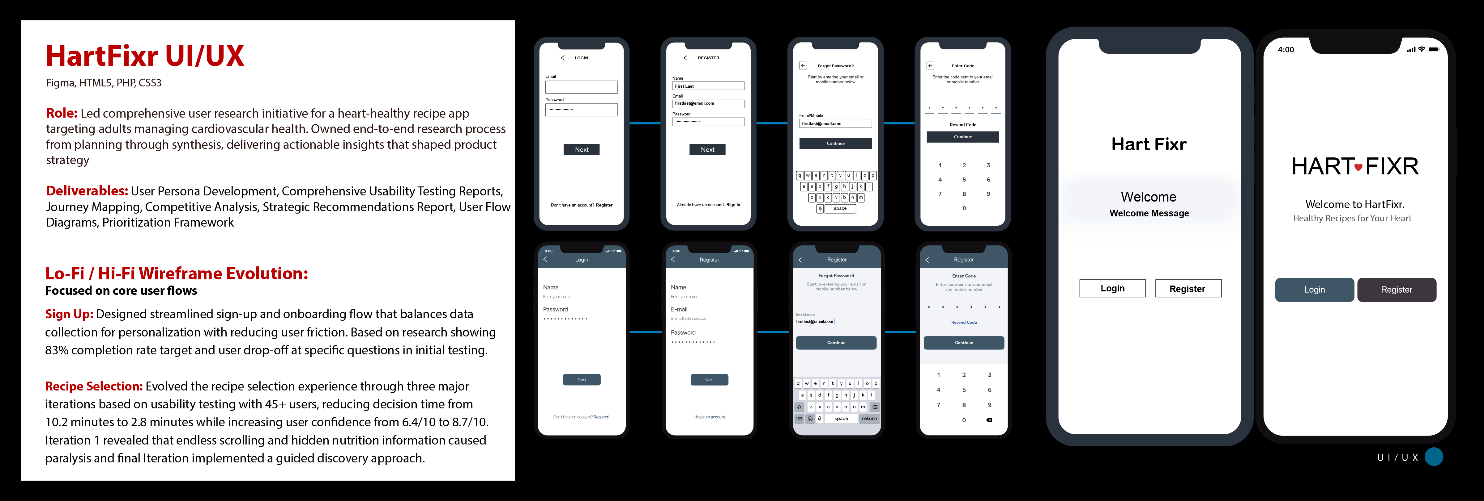
Lo-Fi / Hi-Fi Wireframe Evolution:
Focused on core user flows
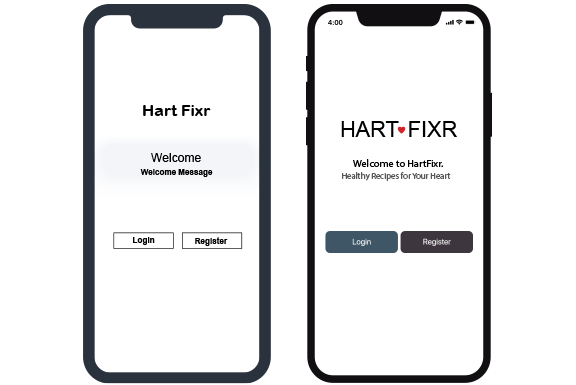
Sign Up: A quick and straigtforard login/registration process to reduce bounce rates.
Viewing a case: A seamless interface for flipping through image series, similar to a Picture Archiving and Communication System (PACS).
Self-assessment: A clean, minimal layout for quizzes to reduce cognitive load and prevent distraction.
Lo-Fi / Hi-Fi Wireframe Evolution:
Focused on core user flows
Recipe Selection: Evolved the recipe selection experience through three major iterations based on usability testing with 45+ users, reducing decision time from 10.2 minutes to 2.8 minutes while increasing user confidence from 6.4/10 to 8.7/10. Iteration 1 revealed that endless scrolling and hidden nutrition information caused paralysis and final Iteration implemented a guided discovery approach.
User Flow:

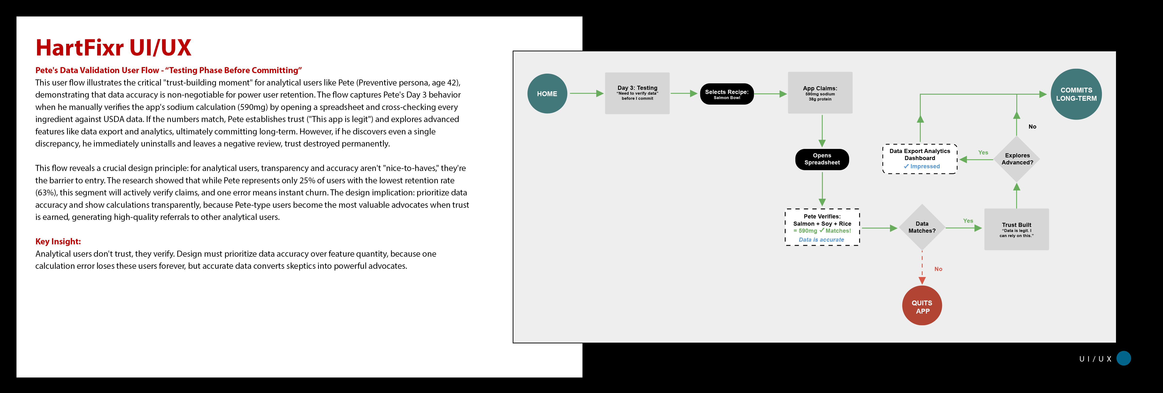
Pete's Data Validation User Flow - “Testing Phase Before Committing”
The Trust-Building moment: This user flow illustrates the critical "trust-building moment" for analytical users like Pete (Preventive persona, age 42), demonstrating that data accuracy is non-negotiable for power user retention. The flow captures Pete's Day 3 behavior when he manually verifies the app's sodium calculation (590mg) by opening a spreadsheet and cross-checking every ingredient against USDA data. If the numbers match, Pete establishes trust ("This app is legit") and explores advanced features like data export and analytics, ultimately committing long-term. However, if he discovers even a single discrepancy, he immediately uninstalls and leaves a negative review, trust destroyed permanently.
This flow reveals a crucial design principle: for analytical users, transparency and accuracy aren't "nice-to-haves," they're the barrier to entry. The research showed that while Pete represents only 25% of users with the lowest retention rate (63%), this segment will actively verify claims, and one error means instant churn.
The design implication: Prioritize data accuracy and show calculations transparently, because Pete-type users become the most valuable advocates when trust is earned, generating high-quality referrals to other analytical users.
Key Insight:
Analytical users don't trust, they verify. Design must prioritize data accuracy over feature quantity, because one calculation error loses these users forever, but accurate data converts skeptics into powerful advocates.
---------------------------------
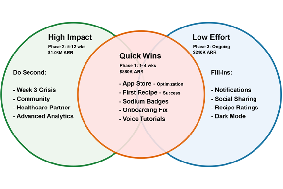
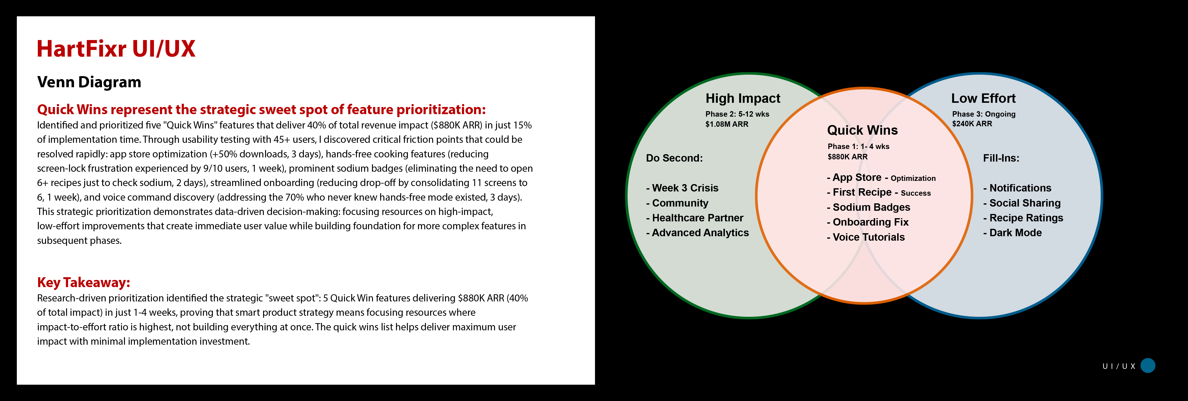
Venn Diagram
Quick Wins - Strategic sweet spot of feature prioritization:
Identified and prioritized five "Quick Wins" features that deliver 40% of total revenue impact ($880K ARR) in just 15% of implementation time. Through usability testing with 45+ users, I discovered critical friction points that could be resolved rapidly: app store optimization (+50% downloads, 3 days), hands-free cooking features (reducing screen-lock frustration experienced by 9/10 users, 1 week), prominent sodium badges (eliminating the need to open 6+ recipes just to check sodium, 2 days), streamlined onboarding (reducing drop-off by consolidating 11 screens to 6, 1 week), and voice command discovery (addressing the 70% who never knew hands-free mode existed, 3 days). This strategic prioritization demonstrates data-driven decision-making: focusing resources on high-impact, low-effort improvements that create immediate user value while building foundation for more complex features in subsequent phases.
Key Takeaway:
Research-driven prioritization identified the strategic "sweet spot": 5 Quick Win features delivering $880K ARR (40% of total impact) in just 1-4 weeks, proving that smart product strategy means focusing resources where impact-to-effort ratio is highest, not building everything at once. The quick wins list helps deliver maximum user impact with minimal implementation investment.
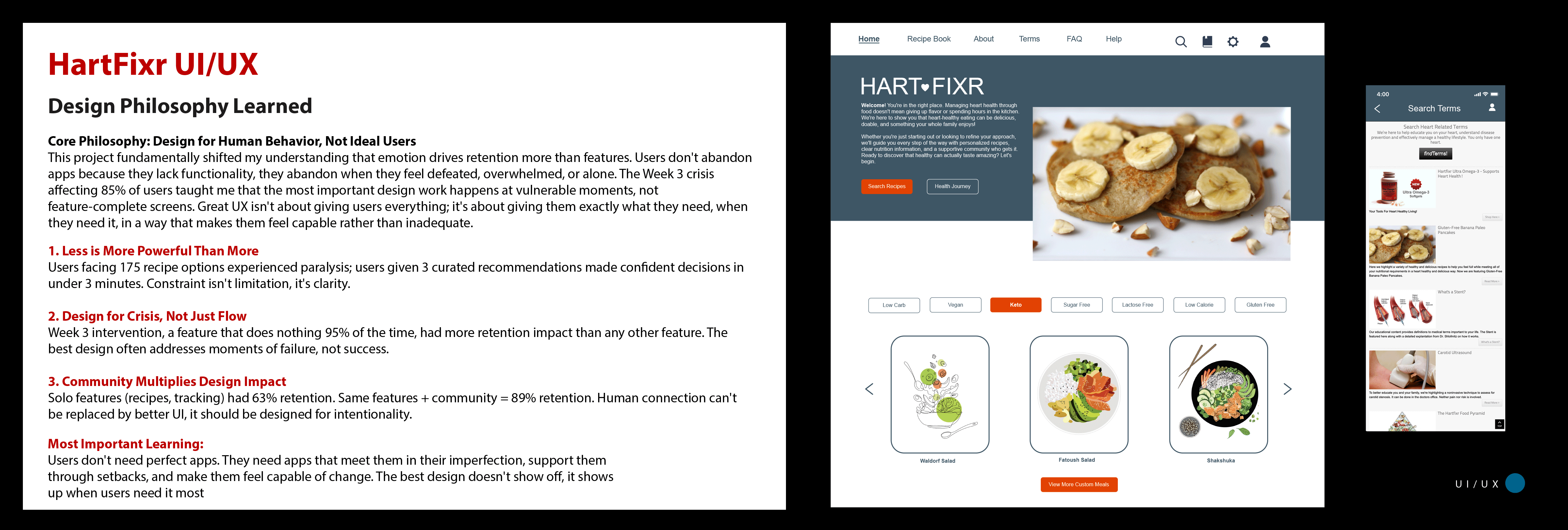
Design Philosophy Learned
Core Philosophy: Design for Human Behavior, Not Ideal Users
This project fundamentally shifted my understanding that emotion drives retention more than features. Users don't abandon apps because they lack functionality, they abandon when they feel defeated, overwhelmed, or alone. The Week 3 crisis affecting 85% of users taught me that the most important design work happens at vulnerable moments, not feature-complete screens. Great UX isn't about giving users everything; it's about giving them exactly what they need, when they need it, in a way that makes them feel capable rather than inadequate.
Less is More Powerful Than More
Users facing 175 recipe options experienced paralysis; users given 3 curated recommendations made confident decisions in under 3 minutes. Constraint isn't limitation, it's clarity.
Design for Crisis, Not Just Flow
Week 3 intervention, a feature that does nothing 95% of the time, had more retention impact than any other feature. The best design often addresses moments of failure, not success.
Community Multiplies Design Impact
Solo features (recipes, tracking) had 63% retention. Same features + community = 89% retention. Human connection can't be replaced by better UI, it should be designed for intentionality.
Most Important Learning:
Users don't need perfect apps. They need apps that meet them in their imperfection, support them through setbacks, and make them feel capable of change. The best design doesn't show off, it shows up when users need it most
Lo-Fi Wireframes
---------------------------------
User FLow
---------------------------------
Venn Diagram
---------------------------------
---------------------------------
--------------------------------------